Figure gallery#
Here are examples of figures built using PyARPES.
Most plotting methods or functions come with a wide array of options, offering countless possibilities for customization. These options allow users to adjust everything from color schemes and line styles to axis scaling and annotations, making it possible to tailor visualizations to specific requirements. Understanding these possibilities is key to unlocking the full potential of data visualization tools. Ultimately, a deep understanding of the original library, such as Matplotlib or HoloViews, may sometimes be required. However, even in such cases, it can be challenging to even begin searching for solutions if you are unaware of what is possible in the first place.
This is why exploring examples and documentation is so important. By observing what others have accomplished, you can better understand the library’s capabilities and discover features that align with your needs. Tutorials and sample code often serve as gateways, enabling you to experiment and steadily deepen your knowledge. However, it’s crucial to balance ambition with practicality. Start with simple visualizations and focus on mastering the fundamentals before attempting complex customizations. This approach ensures a solid foundation and reduces frustration. Remember, learning these tools is an iterative process, and each experiment brings you closer to unlocking their full potential.
[1]:
import numpy as np
import matplotlib.pyplot as plt

# matplotlib default colormap is sufficiently good. But in some case, another colormap is preferred.
# "cmap" includes colormaps of matplotlib, cmocean, colorbrewer, crameri and seaborn.
# "pip install cmap may be required."
import cmap

import arpes
from arpes.io import example_data

#  Most of plotting functions are designed for xr.DataArray (while xr.Dataset can be accepted in many case)
cut = example_data.cut.spectrum
cut2 = example_data.cut2.spectrum
map = example_data.map.spectrum
Activating auto-logging. Current session state plus future input saved.
Filename       : logs/unnamed_2026-03-24_23-29-57.log
Mode           : backup
Output logging : False
Raw input log  : False
Timestamping   : False
State          : active
Very basic:#
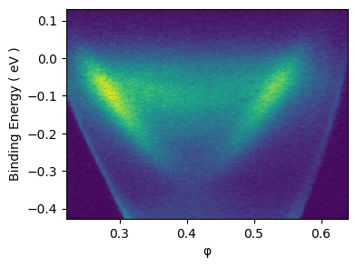
The defact standard for showing the ARPES data is colormesh. Thus, if the xr.DataArray is 2D (i.e. “cut” type data), .S shows data as the color image.
[2]:
cut.S
[2]:
Experimental Conditions
| Key | Value |
|---|---|
| hv | 5.93 eV |
Full Coordinates
| Key | Value |
|---|---|
| x | -0.77043 |
| y | 34.75 |
| z | -3.4e-05 |
| alpha | 0 |
| chi | -0.10909 |
| hv | 5.93 |
| psi | 0 |
| beta | 0 |
| theta | 0 |
| eV | -0.426 to 0.13 by 0.00233 |
| phi | 0.222 to 0.639 by 0.00175 |
Spectrometer
| Key | Value |
|---|
[3]:
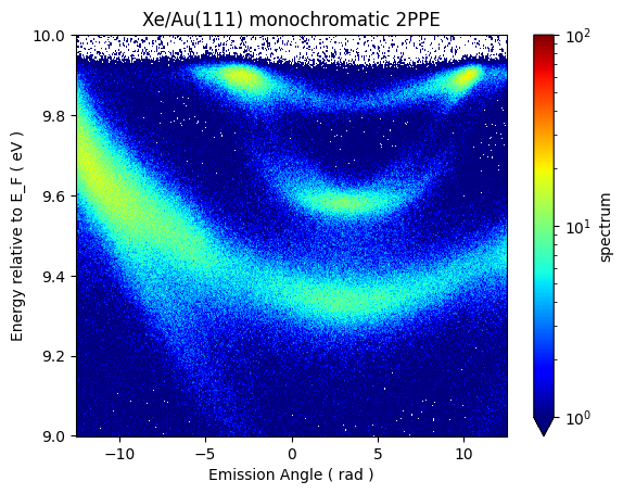
# Logarithmic scale
from matplotlib.colors import LogNorm

fig, ax = plt.subplots()
cut2.transpose("eV", ...).plot(ax=ax, cmap=plt.cm.jet, norm=LogNorm(vmin=1, vmax=100))
ax.set_ylabel("Energy relative to E_F ( eV )")
ax.set_xlabel("Emission Angle ( rad )")
ax.set_title("Xe/Au(111) monochromatic 2PPE")
[3]:
Text(0.5, 1.0, 'Xe/Au(111) monochromatic 2PPE')
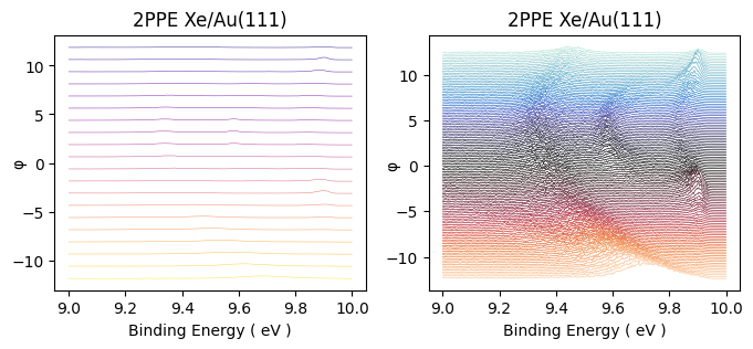
Stack plot#
The colormap is the defact standard for the way to present ARPES data currently. But in most case, especially when the detailed structure of the spectrum is interested, the curve representation is more preferred.
[4]:
from arpes.plotting import stack_plot
[5]:
fig, ax = plt.subplots(nrows=1, ncols=2)
fig.set_size_inches((8, 3))
_, ax[0] = stack_plot.stack_dispersion_plot(
    cut2,
    max_stacks=20,
    scale_factor=0.3,
    title="2PPE Xe/Au(111)",
    linewidth=0.3,
    color="plasma",
    shift=0.00,
    mode="hide_line",
    label="label test",
    # figsize=(7, 5),
    ax=ax[0],
)

_, ax[1] = stack_plot.stack_dispersion_plot(
    cut2,
    max_stacks=130,
    title="2PPE Xe/Au(111)",
    linewidth=0.5,
    color=cmap.Colormap("icefire").to_matplotlib(),
    shift=0.00,
    label="label test",
    mode="hide_line",
    # figsize=(7, 4),
    ax=ax[1],
)
[6]:
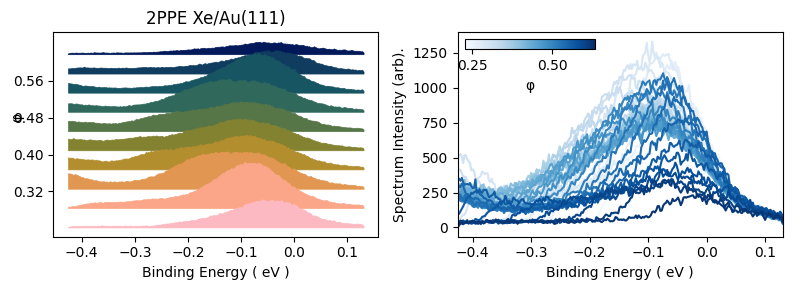
fig, ax = plt.subplots(nrows=1, ncols=2)
fig.set_size_inches((8, 3))
_, ax[0] = stack_plot.stack_dispersion_plot(
    cut,
    max_stacks=10,
    scale_factor=0.1,
    title="2PPE Xe/Au(111)",
    linewidth=0.5,
    color=cmap.Colormap("batlow").to_matplotlib(),
    shift=0.00,
    label="label test",
    mode="fill_between",
    offset_correction="zero",
    ax=ax[0],
)

_, ax[1] = stack_plot.flat_stack_plot(
    cut, color=cmap.Colormap("Blues").to_matplotlib(), max_stacks=40, ax=ax[1]
)

fig.tight_layout()
Fermi surface plot#
Fermi surface plot#
ARPES data with a single spectrum#
XPS#
[ ]: